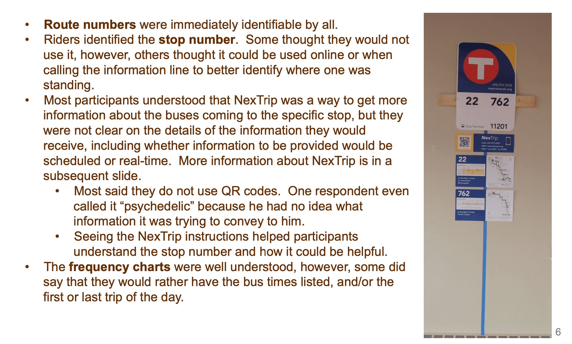
What started as a simple brand refresh for Metro Transit’s bus stop signs evolved into a two-year effort to improve the rider experience at more than 12,000 stops. I led visual design as part of a cross-functional team, working closely with staff, riders, and vendors to create signage that’s clear to read, easy to update, and accessible for all users.
Design goals and systems thinking:
• Identifying the most critical information for riders at the stop
• Boosting rider confidence and ease of use through clear signage
• Meeting accessibility standards (font size, contrast, mounting height)
• Building a maintainable system for file creation, inventory tracking, and ongoing accuracy
• Balancing cost-efficiency with long-term durability (metal signs, reflective adhesive clings, and protective laminates)
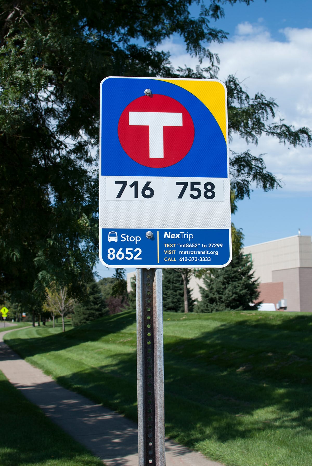
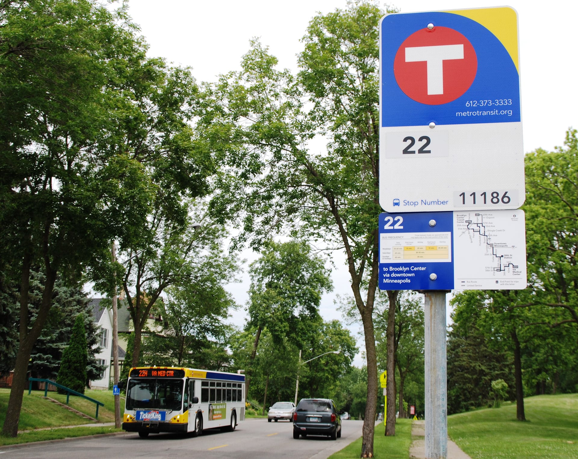
Signage updates included:
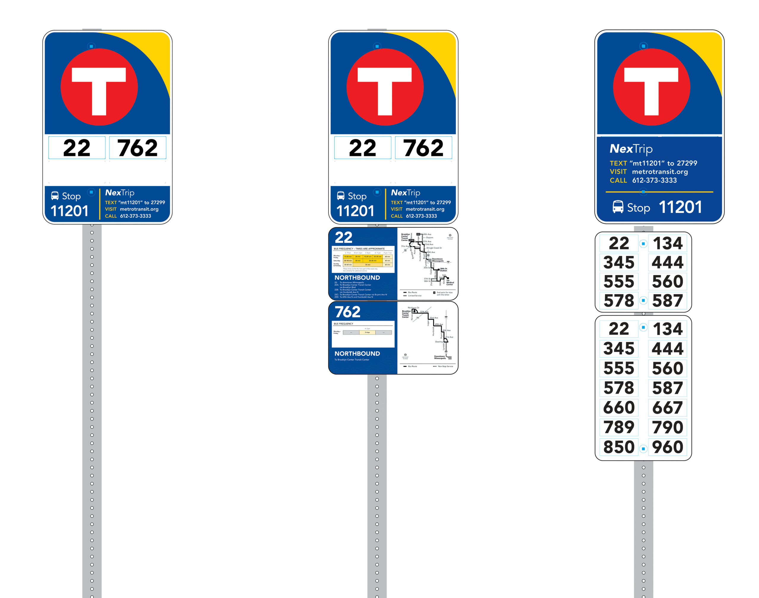
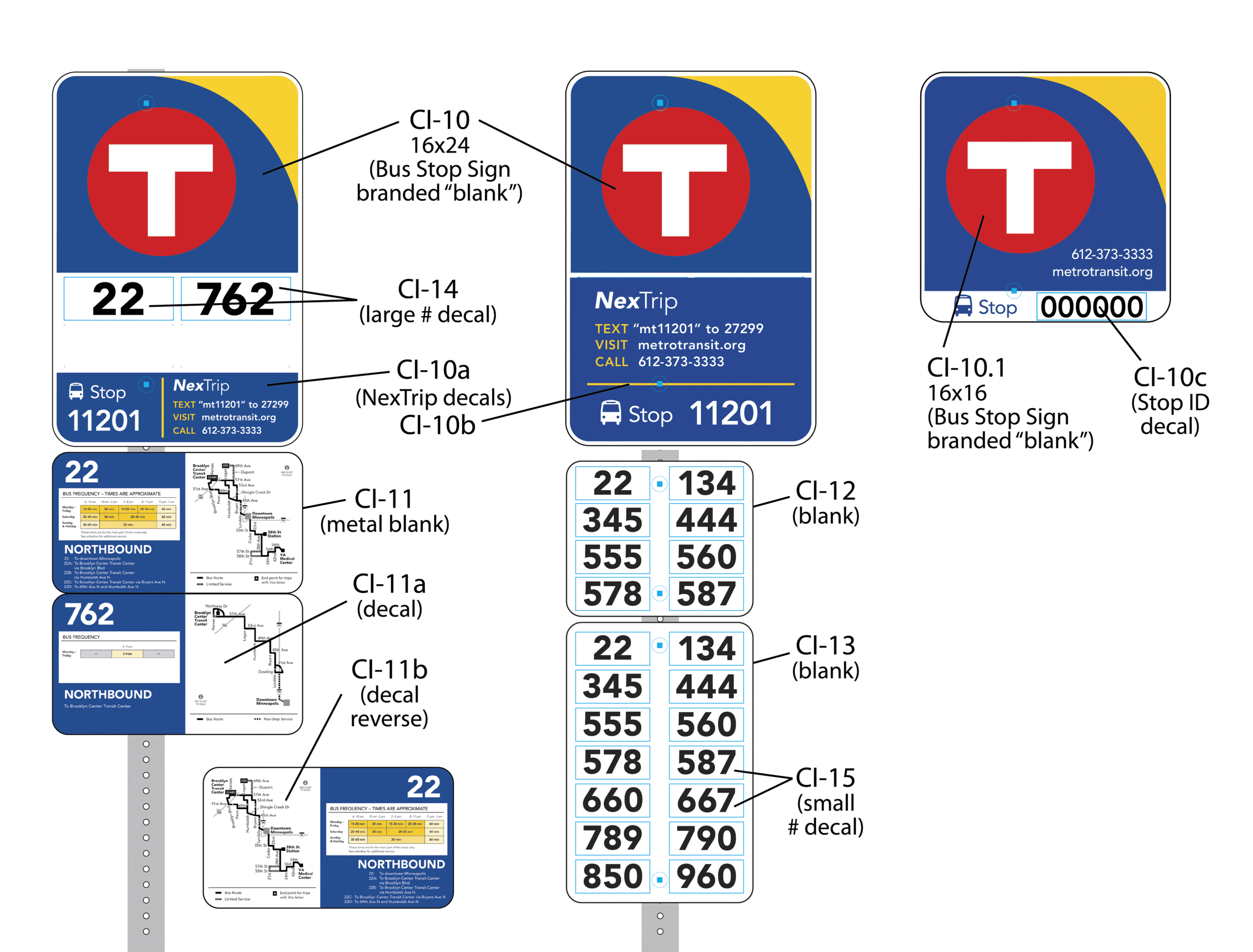
• Route numbers for all buses serving each stop
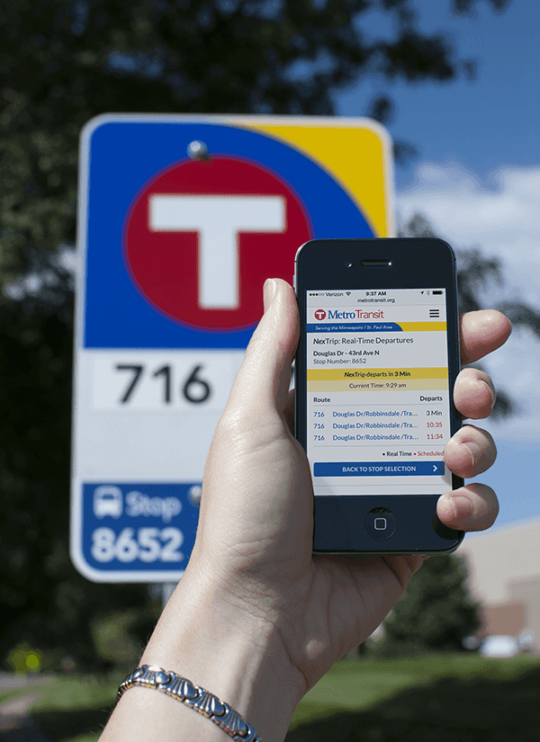
• Unique bus stop ID numbers for accessing NexTrip real-time info
• Clear branding and contact details
• High-demand and high-frequency stops could be expanded with panels for additional routes, maps, and frequency charts
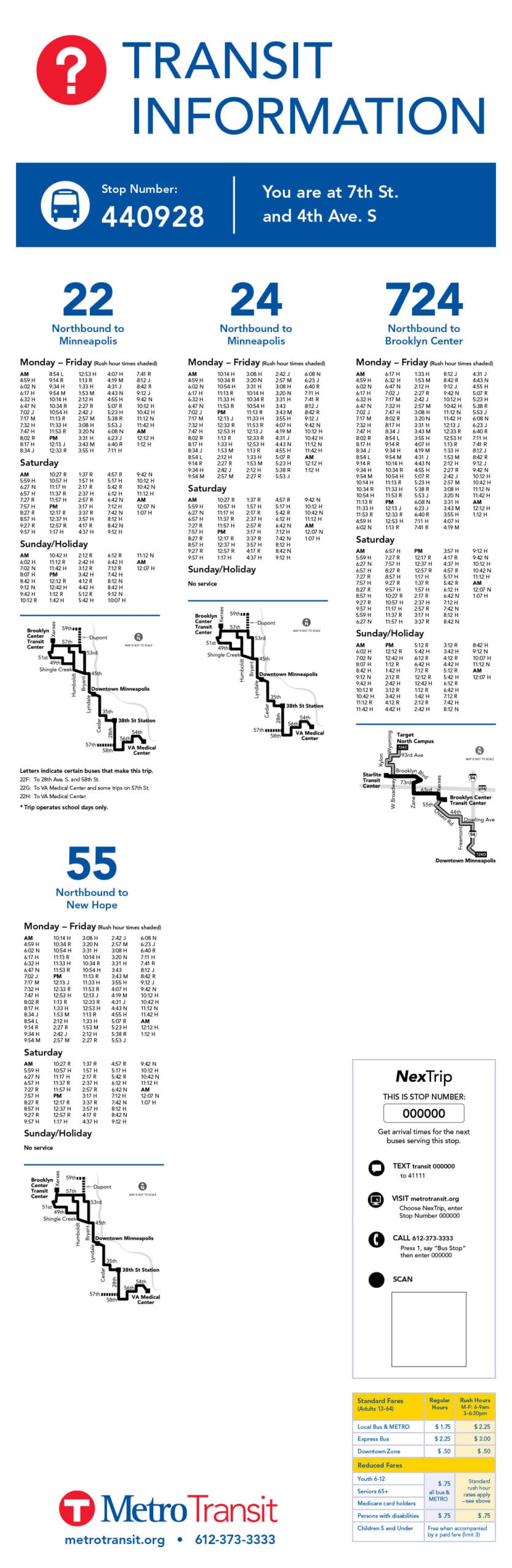
Shelter posters were redesigned to feature:
• Improved hierarchy and legibility
• Visual route maps and fare details
• Multiple options for accessing real-time schedule updates
ClientMetro Transit
CategoryBrandingSigns & Displays